

footer 是页面上的最后一个元素。footer 至少应该处在窗口底部,或者当页面内容高于窗口时,它应该处在下方,这个很容易理解,对吧?
在处理包含 footer 的动态内容时,常常会出现一个问题,即页面内容不够布满页面。这个时候,footer 就不是按我们想的那样固定在页面底部了,而是跑到上面去,或者在它下面有一块空间。
你可以使用绝对定位将 footer 固定在页面底部。这是一种快速的处理方法,但是有它的缺点。如果内容超出窗口,footer 会堵在窗口底部,这可能不是我们想要的效果。
例如:
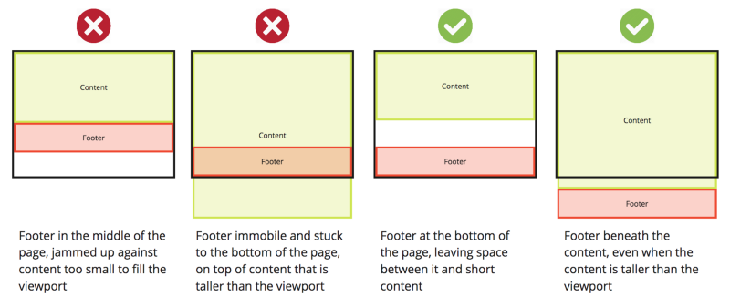
- footer 在页面中间,堵住内容,不够布满窗口
- 当内容超出窗口时,footer 固定堵在页面底部,在内容上面
- footer 在页面底部,在它和较短的内容之间有空间
- 当内容高出窗口时,footer 也在内容底部
我们看看处理方法。
让 footer 受控制
index.html:
<!DOCTYPE html>

<html>
 <head>
   <link rel="stylesheet" type="text/css" href="main.css" />
 </head>

<body>
 <div id="page-container">
   <div id="content-wrap">
     <!-- all other page content -->
   </div>
   <footer id="footer"></footer>
 </div>
</body>

</html>main.css:
#page-container {
  position: relative;
  min-height: 100vh;
}

#content-wrap {
  padding-bottom: 2.5rem;    /* Footer height */
}

#footer {
  position: absolute;
  bottom: 0;
  width: 100%;
  height: 2.5rem;            /* Footer height */
}
这个方法有什么用呢?
page-container包含页面上所有元素,设置最小高度为窗口高度的 100%(vh)。因为它的定位是relative,所以可以在它基础上把它的子元素定位设置为absolute。content-wrap有一个底部 padding,值等于 footer 的高度,确保容器内留有足够空间给 footer。这里使用一个div包含页面的其他内容。footer定位设置为absolute,固定在page-container的底部bottom: 0。这点很重要,因为它不是在窗口中定位为absolute,在page-container高于窗口时,它会往下移动。如上所述,给 footer 的高取一个任意值,2.5rem,上面的content-wrap有使用到。
好啦,现在你的 footer 就会固定在你需要它在的位置了!
小结
当然,这段 CSS 不完整,不包括一些关于移动端 UX 的考虑以及另一种方法(使用 min-height: 100% 而不是100vh)。
也可以使用 Flexbox(包括 flex-grow)或者网格。这两种方法都很强大。
你可以自由选择使用哪种方法,根据你的设计的实际情况来选择。希望上面的示例和链接可以在你做选择时帮你节省时间。
原文:How to keep your footer where it belongs ?,作者:Dominic Fraser