如果你曾经使用过 CSS,那么你就会知道定位元素有多么困难。在本教程结束时,你将了解更多关于 CSS 定位和 Flexbox 的知识,并且你可以在项目中轻松定位元素。
首先,让我们了解一些关于 CSS 定位的基础知识。
CSS position 属性
你可以使用 CSS position 属性根据需要在 CSS 中定位元素、div 和容器。 position 属性的好处在于,你可以使用它来将应用程序的元素排列在你想要的任何位置,并且它易于学习和实现。
CSS 中有五种类型的定位:
- 静态定位
- 相对定位
- 绝对定位
- 固定定位
- 粘性定位
让我们一一了解它们。
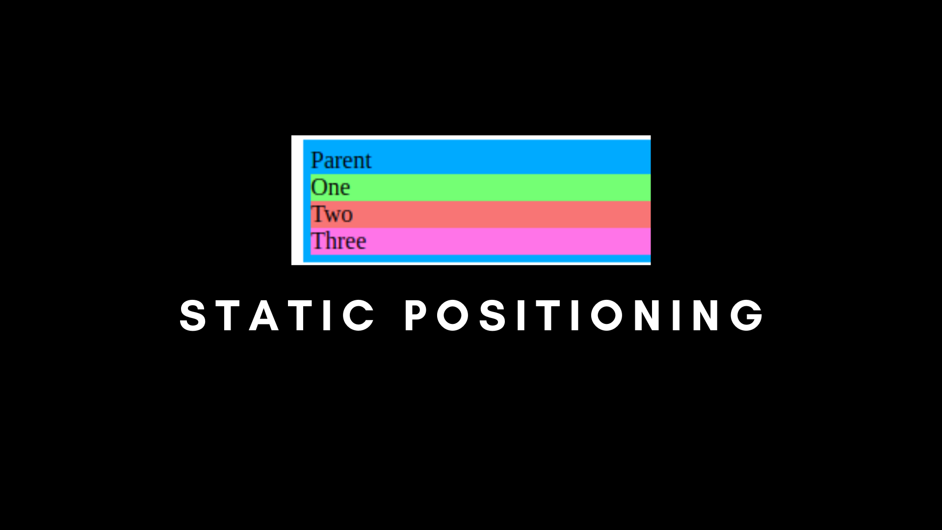
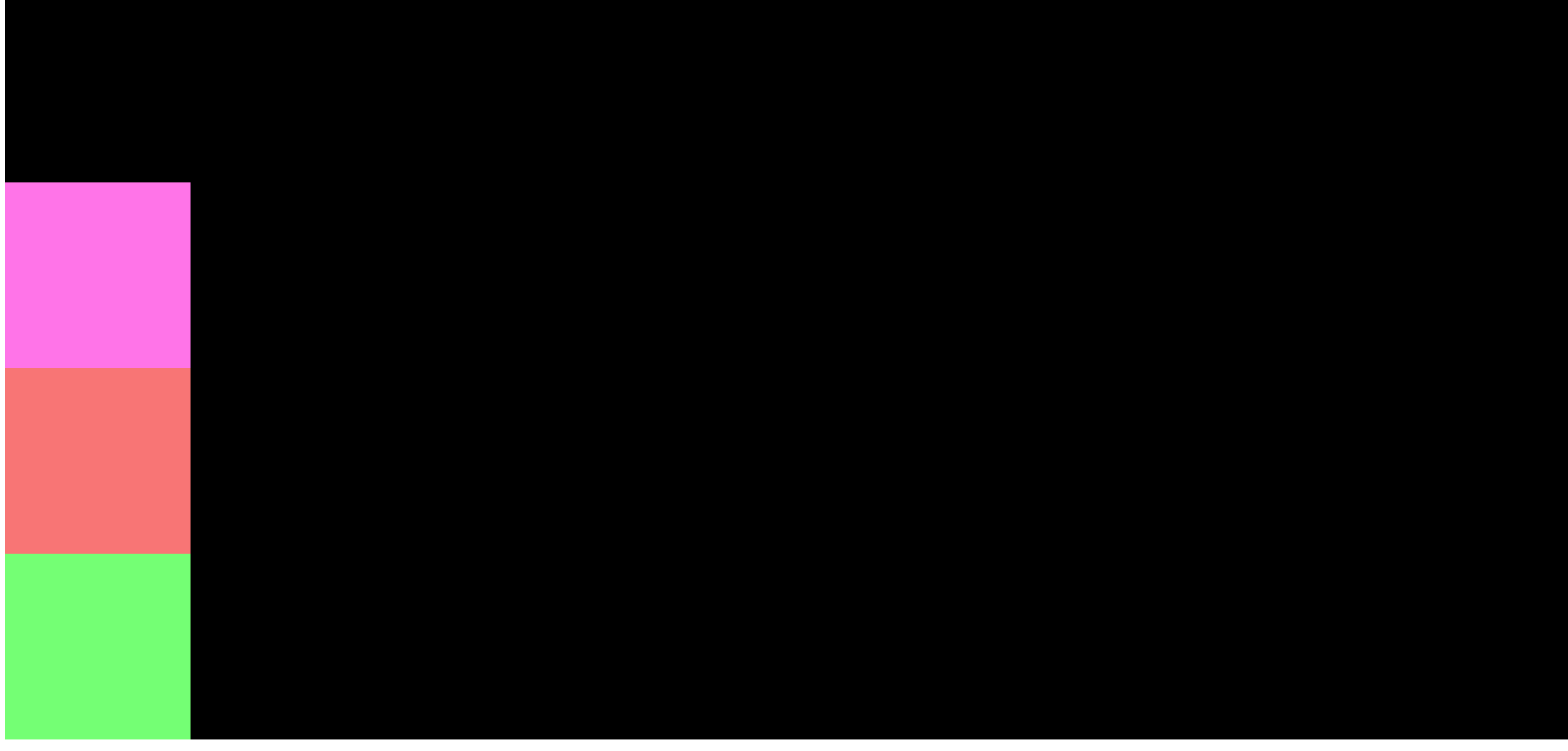
CSS 静态定位
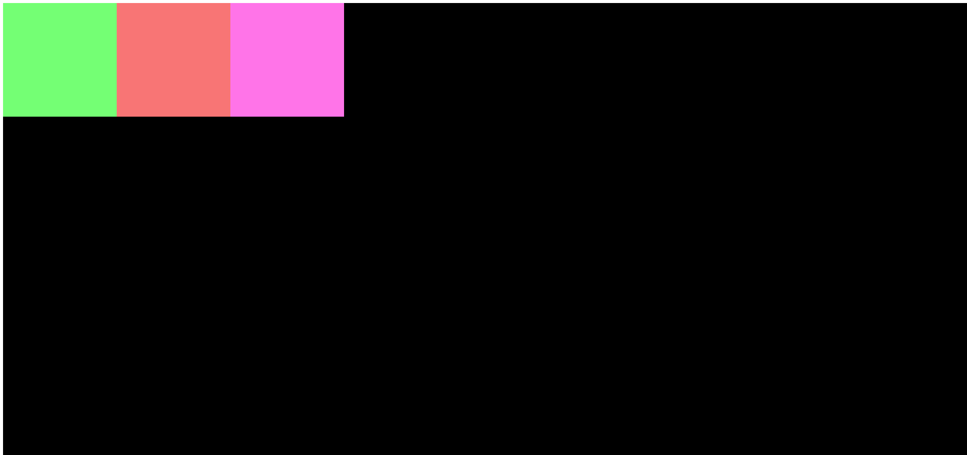
静态定位是 CSS 中使用的默认定位属性。它始终按照页面的正常流进行。无论哪个元素首先出现在你的文档中,它都将首先显示。
代码如下:
/* Static Positioning */
.parent {
    padding: 5px;
    position: static;
    background-color: #00AAFF;
    width: 40%;
  }

  .child-one {
  	position: static;
    background-color: rgb(116, 255, 116);
  }

  .child-two {
  	position: static;
    background-color: rgb(248, 117, 117);
  }

  .child-three {
  	position: static;
    background-color: rgb(255, 116, 232);
}<!DOCTYPE html>
<html lang="en">
<head>
<meta charset="UTF-8">
<meta name="viewport" content="width=device-width, initial-scale=1.0">
<title>CSS Position and Flexbox</title>
<link rel="stylesheet" href="./index.css">
</head>
<body>
<div class="parent">Parent
<div class="child-one">One</div>
<div class="child-two">Two</div>
<div class="child-three">Three</div>
</div>
</body>
</html>在上面的例子中,我们有父级元素(parent),然后是子级元素(child-one、child-two、child-three)。它们都是按照静态定位排列的,也就是按照页面的正常流动。
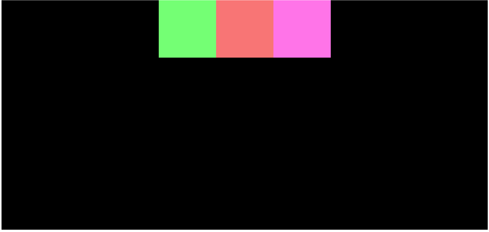
CSS 相对定位
相对定位与静态定位完全一样,但有一个问题。
我们可以在相对定位中做四件事,而静态无法做到:我们可以将元素移动到左、右、下和上方向。
让我们通过一个例子来理解我的意思。
/* Relative Positioning */
.parent {
    padding: 5px;
    background-color: #00AAFF;
    width: 40%;
  }

  .child-one {
    position: relative;
    background-color: rgb(116, 255, 116);
  }

  .child-two {
    background-color: rgb(248, 117, 117);
  }

  .child-three {
    background-color: rgb(255, 116, 232);
  }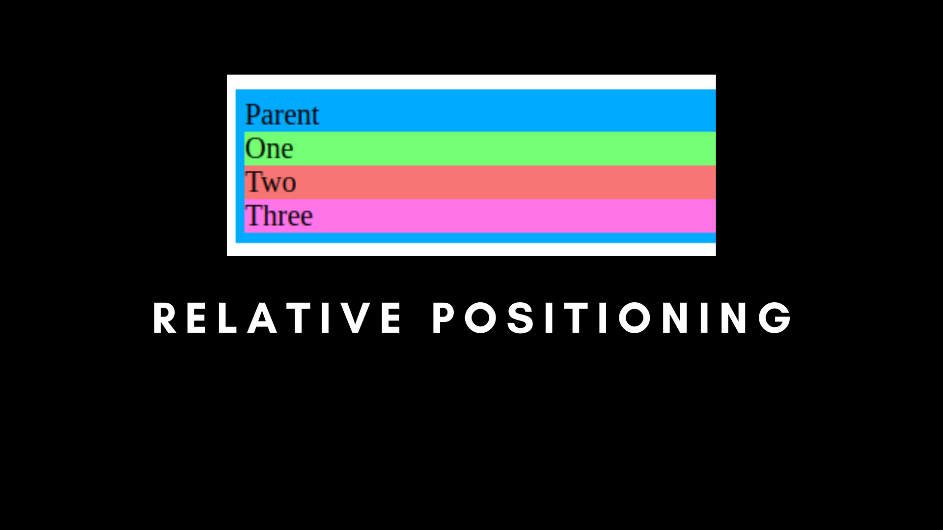
如果我们运行我们的应用程序,会看到输出没有区别。换句话说,静态和相对定位是相同的,除非我们使用相对的顶部、底部、左侧和右侧。
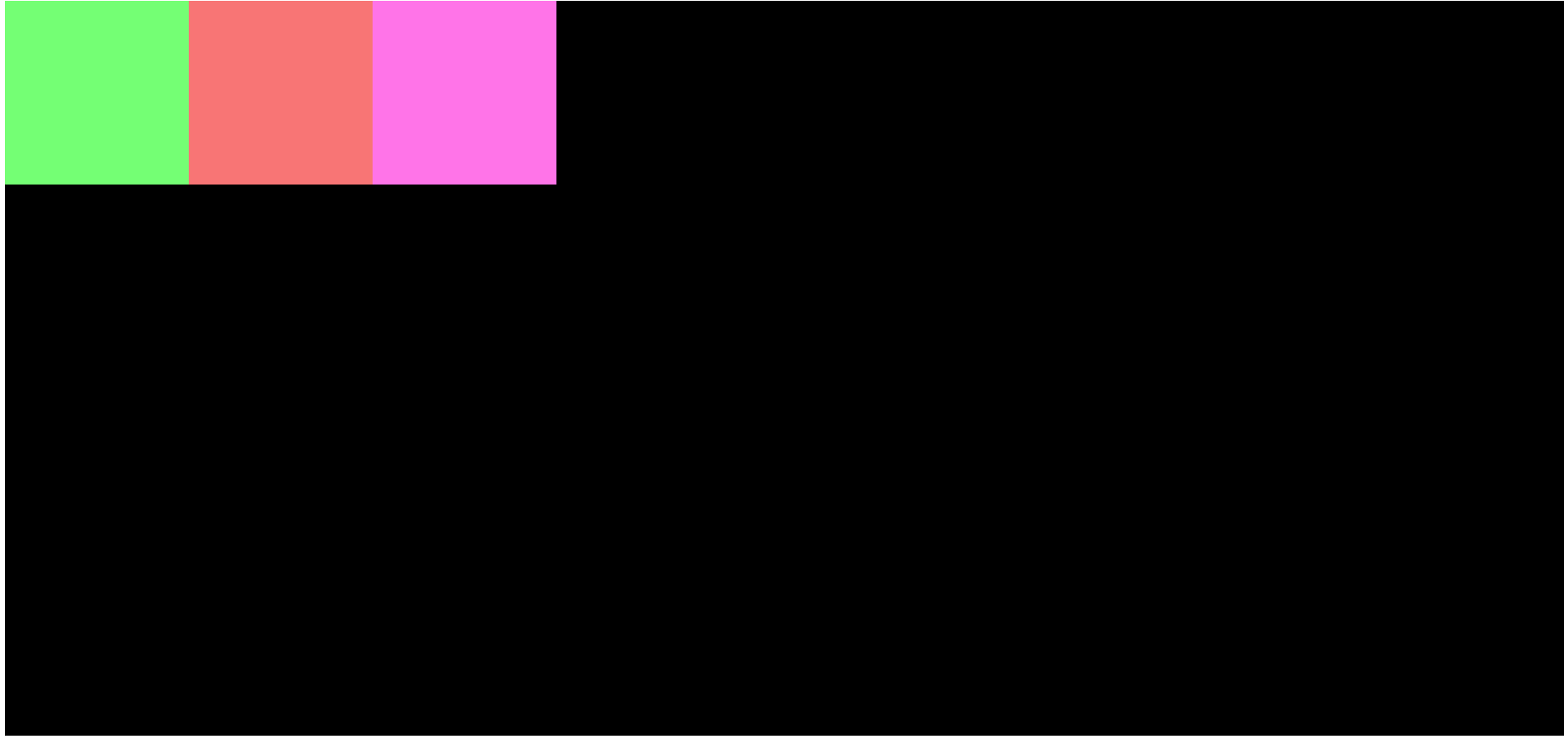
让我们尝试使用顶部、底部、左侧和右侧。
/* Relative Positioning with Top, Bottom, Left and Right */
.parent {
padding: 5px;
background-color: #00AAFF;
width: 40%;
}
.child-one {
position: relative;
top: 10px;
background-color: rgb(116, 255, 116);
}
.child-two {
background-color: rgb(248, 117, 117);
}
.child-three {
background-color: rgb(255, 116, 232);
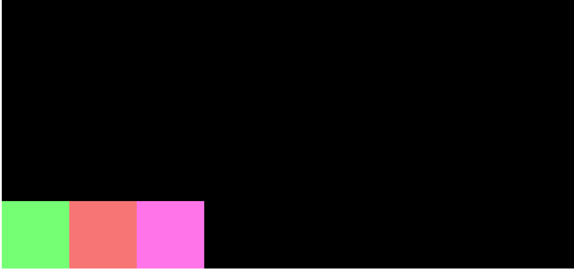
}我们在 child-one 中使用 Top 和 Relative。
这会将 child-one 抛出文档流,它将从顶部移动到底部 10px。
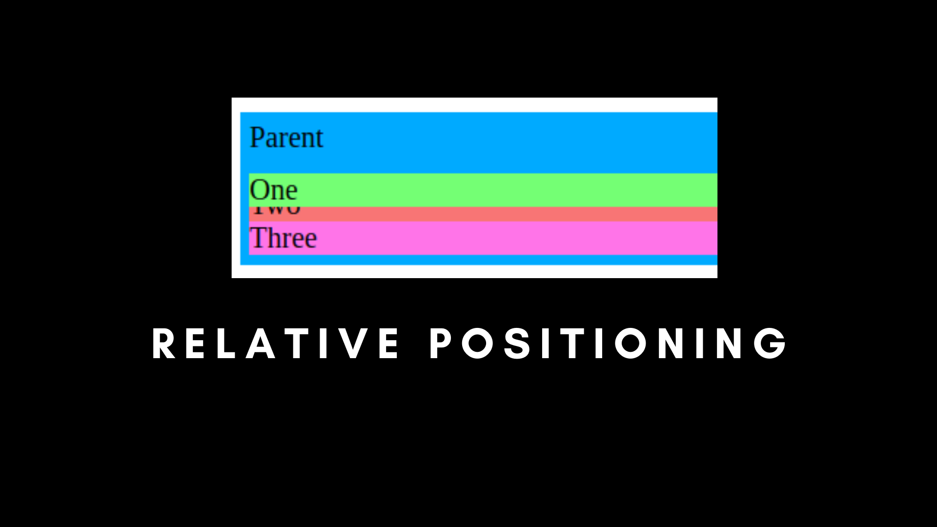
你可以看到它覆盖了 child-two 元素。如果使用 left、right 或 bottom 也是类似情况。
child-one 覆盖 child-two 的主要原因是 child-one 不再是正常文档流的一部分,但 child-two 和 child-three 是。
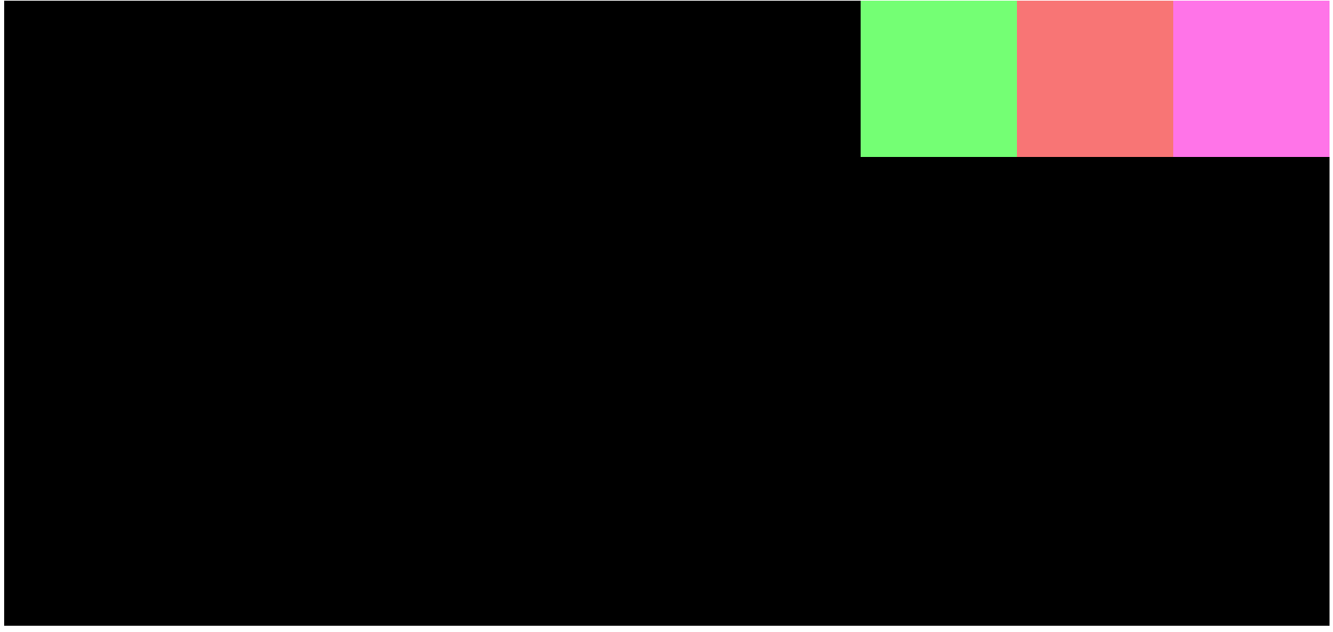
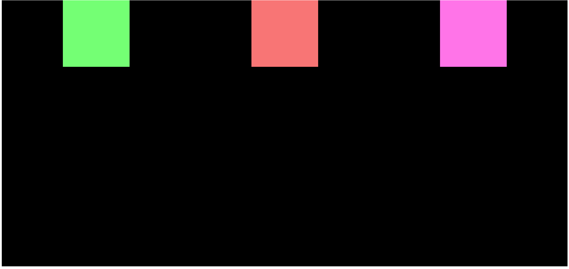
CSS 绝对定位
定位元素的另一种方法是使用绝对定位。这种定位将元素从文档流中完全移除。所有其他元素将忽略具有绝对属性的元素。
而如果我们使用 Top、Bottom、Left、Right 和 Absolute,它会根据父容器排列元素,条件是父容器也必须是绝对定位的。
/* Absolute Positioning */
.parent {
    padding: 5px;
    background-color: #00AAFF;
    width: 40%;
    position: static;
  }

  .child-one {
    position: absolute;
    top: 0px;
    background-color: rgb(116, 255, 116);
  }

  .child-two {
    background-color: rgb(248, 117, 117);
  }

  .child-three {
    background-color: rgb(255, 116, 232);
  }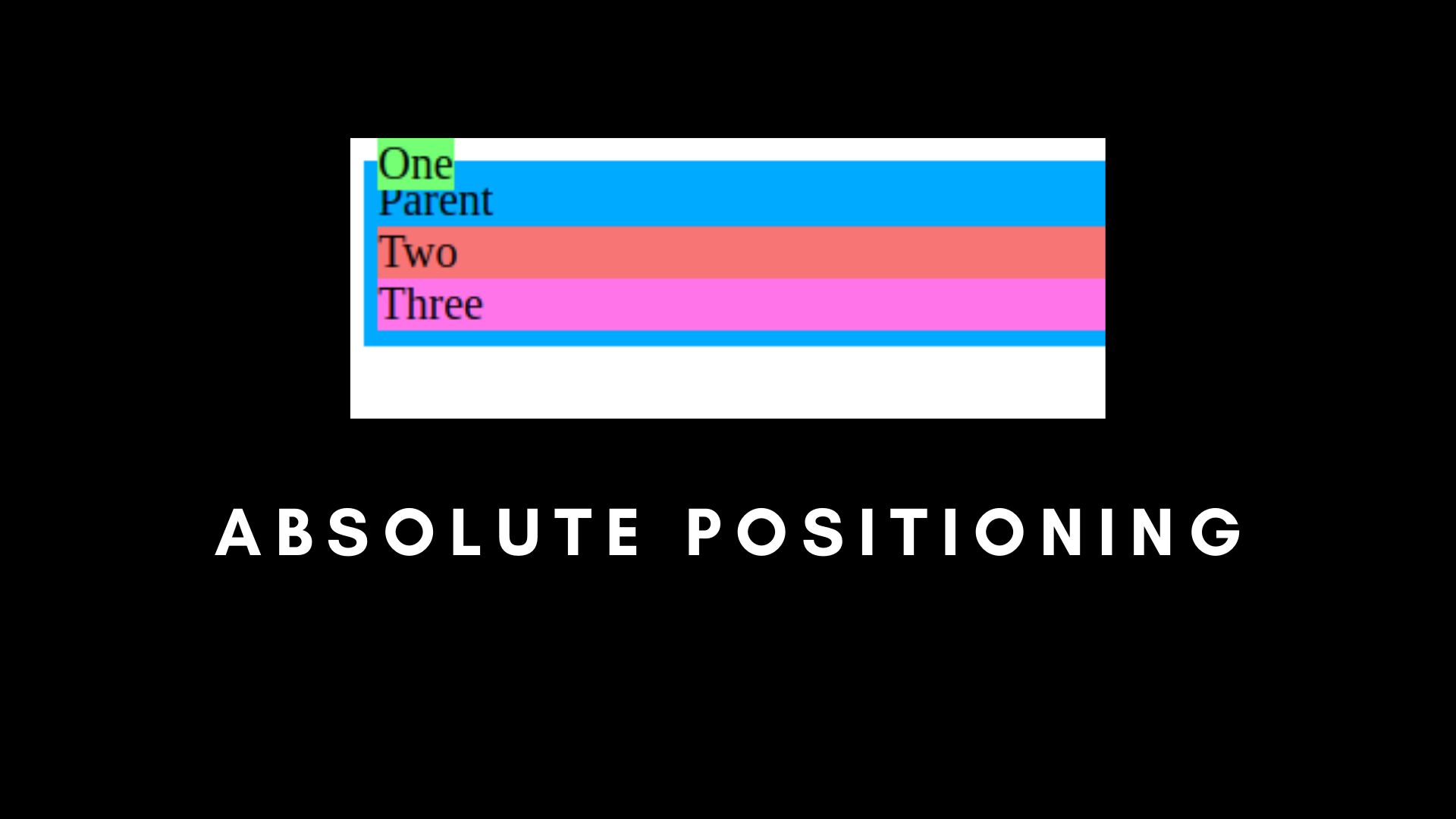
在这里,如果我们将 Top 设置为 0px,则 child-one 在文档的正常流之外。
那是因为 child-one 是绝对的,而 parent 是静态的。
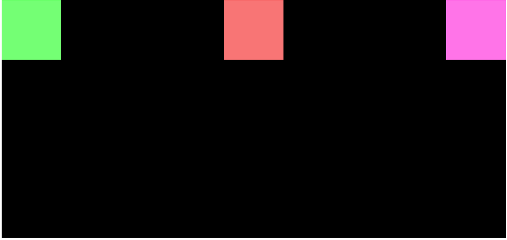
但是如果我们将父级设置为绝对定位,在顶部 0px 位置呢?
/* Absolute Positioning */
.parent {
    padding: 5px;
    background-color: #00AAFF;
    width: 40%;
    position: absolute;
    top: 0px;
  }

  .child-one {
    position: absolute;
    top: 0px;
    background-color: rgb(116, 255, 116);
  }

  .child-two {
    background-color: rgb(248, 117, 117);
  }

  .child-three {
    background-color: rgb(255, 116, 232);
  }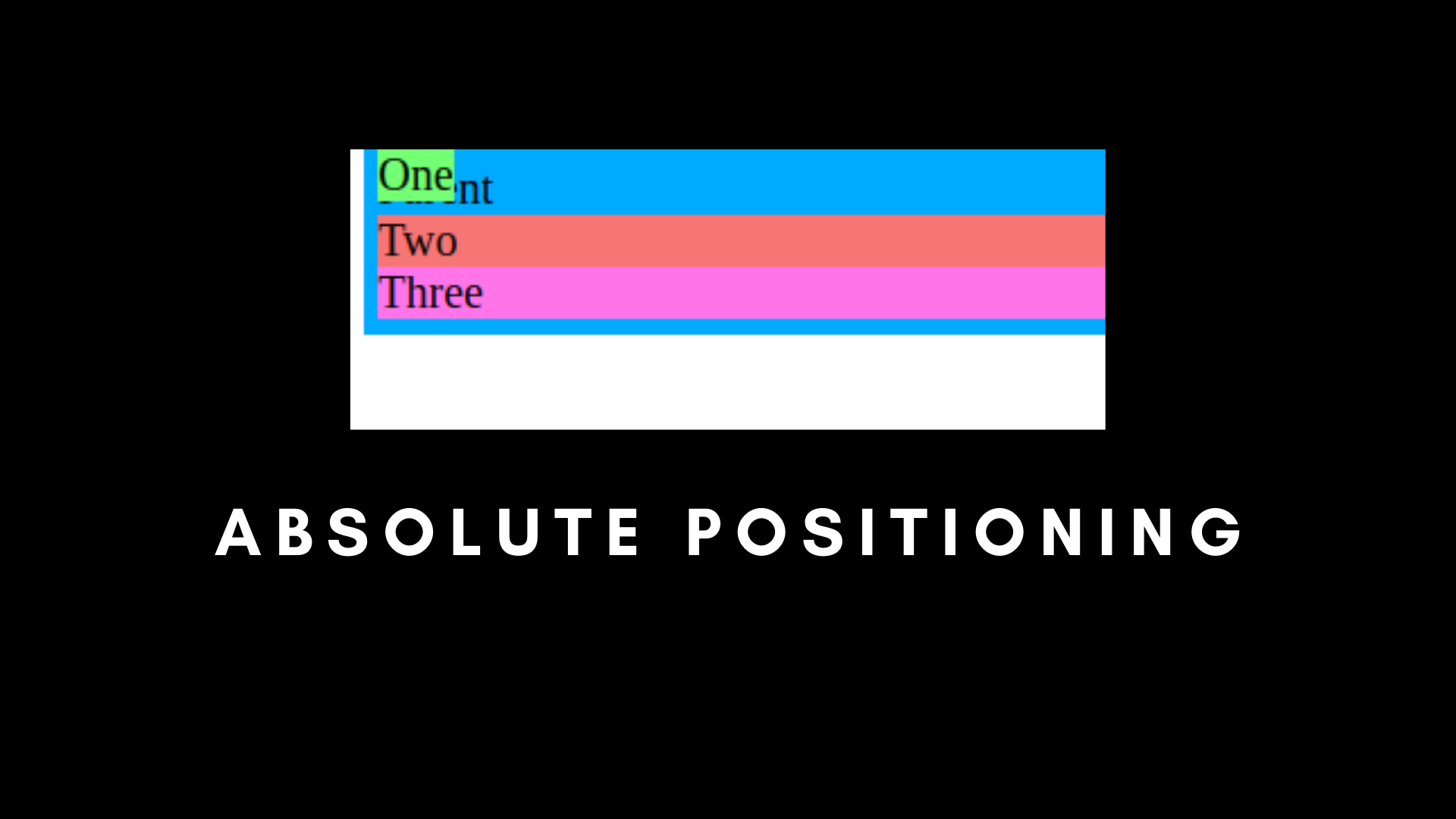
在这里,你可以看到第一个子元素与父元素重叠,并且它们都位于顶部,为 0px。
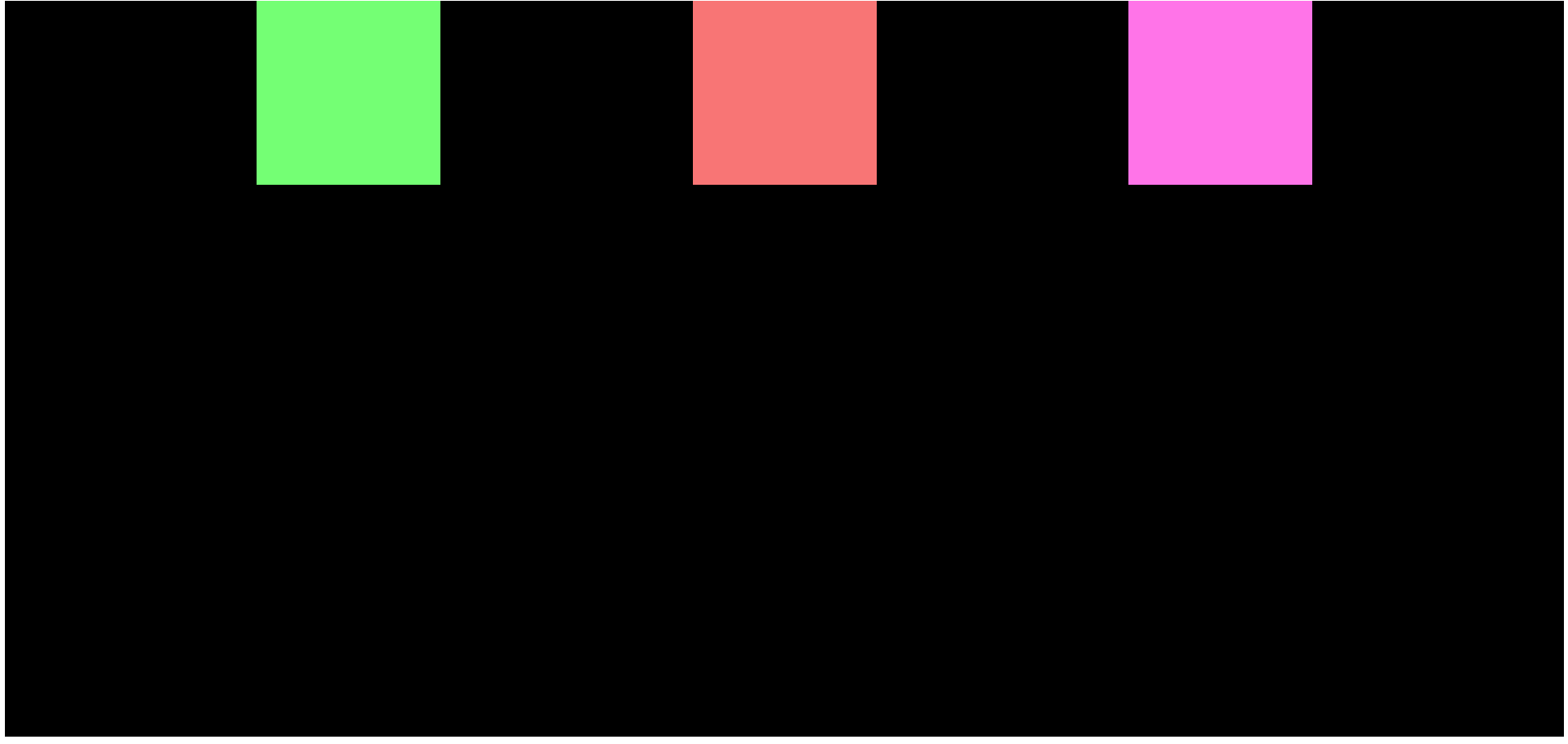
还有第三个用例,我们可以将 Parent 设置为相对,将 child-one 设置为绝对。
/* Absolute Positioning */
.parent {
    padding: 5px;
    background-color: #00AAFF;
    width: 40%;
    position: relative;
    top: 0px;
  }

  .child-one {
    position: absolute;
    top: 0px;
    background-color: rgb(116, 255, 116);
  }

  .child-two {
    background-color: rgb(248, 117, 117);
  }

  .child-three {
    background-color: rgb(255, 116, 232);
  }
当我们使用相对和绝对时,这是最有用的用例。现在,你可以看到我们的 child-one 是相对于父元素的,而不是整个文档。
简单来说,如果将父级固定为相对,子级固定为绝对,则子级将把父级作为其容器。
CSS 固定定位
还记得绝对和相对定位吗?有一个定位完全忽略了父元素,那就是固定定位。
固定定位是根据整个 HTML 文档固定的。它不会跟随任何其他父级,即使它被设置为相对。
另一件事是,如果我们将某些东西设置为固定的,即使我们滚动页面,它也会保持在相同的位置。
固定定位主要用于浮动项目和按钮。
/* Fixed Positioning */
.parent {
    padding: 5px;
    background-color: #00AAFF;
    width: 40%;
    position: relative;
    top: 0px;
    height: 1000px;
  }

  .child-one {
    position: fixed;
    top: 0px;
    background-color: rgb(116, 255, 116);
  }

  .child-two {
    background-color: rgb(248, 117, 117);
  }

  .child-three {
    background-color: rgb(255, 116, 232);
  }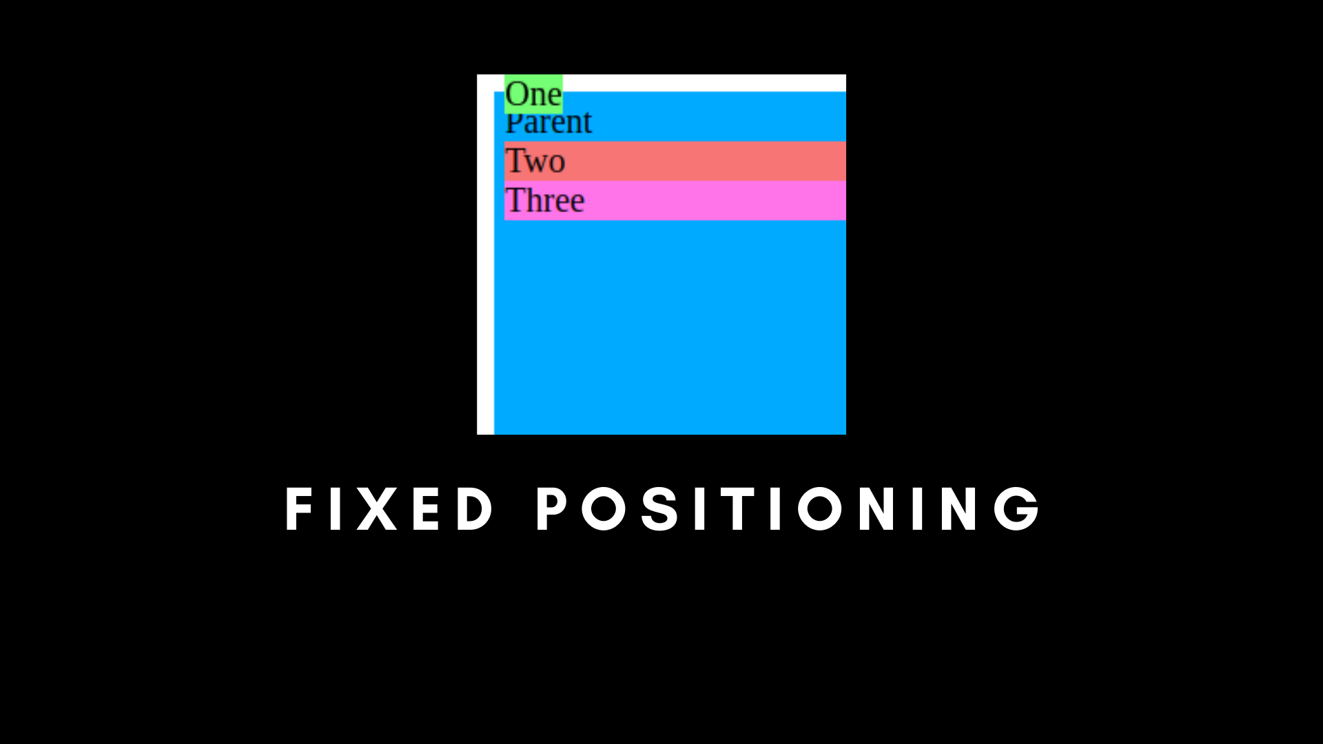
可以看到第一个元素完全脱离了它的父组件,即使父组件被设置为相对。
如果我们滚动页面,其余的子元素将根据文档流动,但固定的子元素将保持不变。
CSS 粘性定位
粘性位置是相对和固定的组合。
/* Sticky Positioning */
.parent {
    padding: 5px;
    background-color: #00AAFF;
    width: 40%;
    position: relative;
    top: 0px;
    height: 1000px;
  }

  .child-one {
    position: sticky;
    top: 0px;
    background-color: rgb(116, 255, 116);
  }

  .child-two {
    background-color: rgb(248, 117, 117);
  }

  .child-three {
    background-color: rgb(255, 116, 232);
  }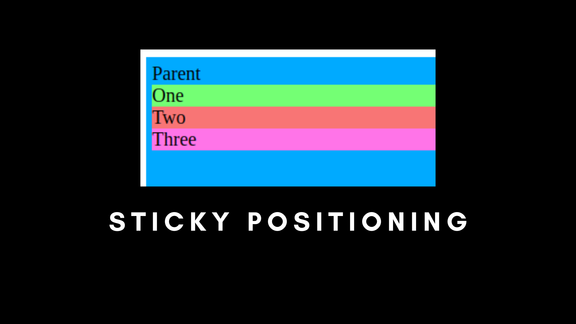
如果我们将子元素设置为粘性定位,它会看起来很正常,就像相对的。但是一旦我们开始滚动页面,粘性子元素就会粘在顶部。它将成为一个固定的定位。
粘性定位主要用于创建导航栏。
现在我们已经理解了 CSS 定位,让我们专注于 Flexbox。
如何使用 Flexbox
你可以使用 CSS Flexbox 属性在不使用浮动的情况下排列项目。这使得在文档中排列项目变得更加容易。你可以使用它来替换 CSS 中的网格(Grid)。
如果没有 Flexbox,我们的输出将与文档一起流动,即 child-1,然后 child-2,然后 child-3。
但是如果我们希望它们水平并排,如下图所示呢?

解决方案是使用 Flexbox。我们需要将它们相对于行或列均匀放置,它们之间或周围有空格。
首先,让我们创建一个包含三个子级的父 div。
<!DOCTYPE html>
<html lang="en">
<head>
    <meta charset="UTF-8">
    <meta name="viewport" content="width=device-width, initial-scale=1.0">
    <title>CSS Position and Flexbox</title>
    <link rel="stylesheet" href="./index.css">
</head>
<body>
    <div class="parent">
        <div class="child-one"></div>
        <div class="child-two"></div>
        <div class="child-three"></div>
    </div>
</body>
</html>
/* Flexbox container */
.parent {
background-color: #00AAFF;
width: 300px;
height: 300px;
display: flex;
}
.child-one {
background-color: rgb(116, 255, 116);
width: 300px;
height: 300px;
}
.child-two {
background-color: rgb(248, 117, 117);
width: 300px;
height: 300px;
}
.child-three {
background-color: rgb(255, 116, 232);
width: 300px;
height: 300px;
}我们可以看到 parent 已经被声明为 flex。

在这里,我们有三个 div 框,每个都有不同的颜色。这是默认的 Flexbox 排列。
让我们看看 Flexbox 中不同类型的排列。
如何使用 Flexbox 排列元素
Flex 方向
此属性定义你的元素在屏幕上的显示方式,即垂直或水平方式。
Row 用于水平排列项目。
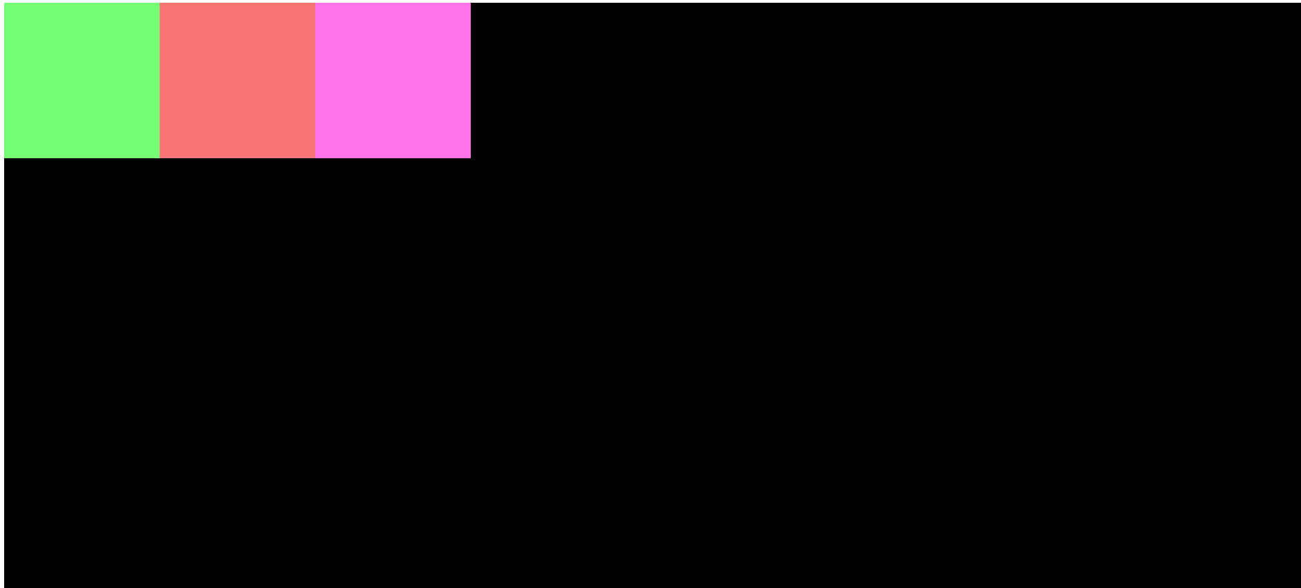
如你所见,我们在水平行中进行了排列。
Column 垂直排列项目,如下所示:

正方形现在排列在垂直列中。
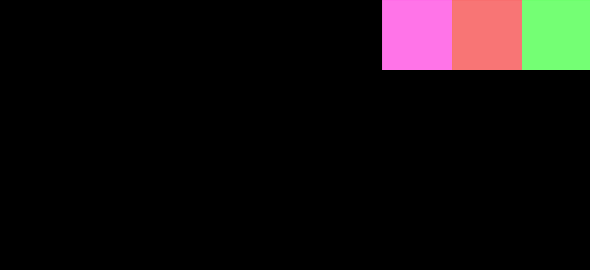
Row Reverse 的工作方式与 row 完全相同,但元素的位置将颠倒。第一个元素将是最后一个,最后一个元素将移动到第一个。项目的排列将与 flex-direction: row 相反。
Column Reverse 的工作方式与 column 完全相同,但元素将被反转。第一个元素将是最后一个,最后一个元素将移动到第一个。
Justify Content
此属性确定元素的水平对齐方式。
Center 将元素设置为页面的水平中心。
Flex Start 将元素定位在页面的开头。
Flex End 将元素定位在页面的末尾。
Space Around 均匀地排列项目,但它们之间有空间。弹性盒容器内的所有元素之间的空间将相等,但不在它们之外。
在这里,child-one、child-two 和 child-three 之间的空间是相等的,但在外面不相等。
Space Between 最大化子元素之间的空间(它是一个 Justify Content 属性)。
Space Evenly 在子元素和 FlexBox 容器外的空间之间均匀分布相等的空间。
Align Items
Align items 用于在 flex 容器内垂直对齐项目。但这仅在有固定高度时才有效。
Center 将元素设置为垂直页面的中心。
Flex Start 与将内容对齐到中心相同,但它垂直排列元素。在我们的例子中,元素将位于屏幕的左上角。
Flex End 与 Flex Start 相同,但这会将项目对齐到屏幕的左下角。
现在你了解 Flexbox 的基础知识了。
如何在屏幕中心对齐项目
这些 Flexbox 属性也可以一起使用。例如,如果我们想将项目排列在最中心,我们可以同时使用 align-items: center 和 justify-content: center。

如果你想自己做实验,可以在 GitHub 查看代码。
感谢你阅读本文!
原文:How CSS Positioning and Flexbox Work – Explained with Examples,作者:Nishant Kumar